Sprite Designs







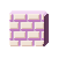
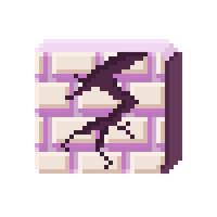


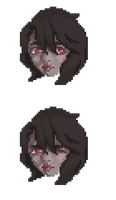
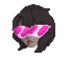
After I had finished sketching what kind of UI I wanted I immediately started working on sprites for my game.
I started off with the Health UI icon of Izabelle and individual health sprites shaped like crystal batteries. Then I worked on "enemies" for my game, which is why one of the orange orbs have a face on it. However, that design is not in my game but has inspired me to create the version with spikes on it. Eventually this "enemy" sprite became my data collectible that allowed you to move across levels faster. I had concluded my game required some sort of progression bar since each stage was about 3 minutes long.
During this time I also created these pink wall sprites that represented firewalls and although my game did not have sounds during this time, I knew I needed some sort of THUD sound or even some error sound to enhance it. It was from the playtest during class and in the NYU game center that I gathered the need to create destroyable objects in my game and so the weaker walls were created for the early stages of the game.
For stage 4, I created another data collectible, that being the cyan orb while the dark berry colored orb is the main "enemy" in stage 4.
The Izabelle sprite sheet I created was to produce feedback everytime the player was damaged, but I was not able to get that to work. The Izabelle with sick magenta shades is inspired by how much of a banger stage 3 is.
Files
Get Illya: Hacking into the Gate
Illya: Hacking into the Gate
An 8-bit SHMUP with bangers
| Status | In development |
| Author | Michelle Tu |
| Genre | Shooter |
| Tags | Pixel Art, Shoot 'Em Up, Singleplayer |
More posts
- Illya PresentationOct 04, 2019
- 9.26: Playtest (in class & NYU Game Center)Oct 04, 2019
- Initial ProcessOct 04, 2019
- PostmortemOct 04, 2019
- Week 6 NotesOct 04, 2019
- Week 4 NotesOct 04, 2019
- Week 3 NotesOct 04, 2019

Leave a comment
Log in with itch.io to leave a comment.